About Our Logo
The South Heartland District Health Department logo was designed to express numerous characteristics of our organization.
The yellow graphic element represents a shield protecting our communities, while the transparent effect symbolizes a screen or filter, which, figuratively, “helps control” risks entering our region.
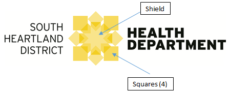
The four outer squares represent the four counties we serve:
Adams, Clay, Nuckolls, and Webster Counties.
The numerous interconnections and overlaps within the graphic represent our coordination with various partner agencies.
Public Health Logo
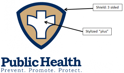
The National Association of County and City Health Officials (NACCHO), a nonprofit membership organization representing local health departments throughout the United States, created the national identity to help increase the visibility of local health departments, and broaden the public’s understanding about the role of local health departments and how their work benefits both individuals and the community-at-large. NACCHO created the logo to identify and distinguish governmental public health, which has unique legal responsibilities and authorities. Over time, use of this recognizable symbol should reassure people in the community that their public health department is working for their health and safety.
The shield is a symbol that illustrates health, protection, and growth. The three point symmetry reinforces the three core functions of public health that are conveyed in the theme line: Prevent. Promote. Protect. We believe this simple, elegant statement conveys what public health does – and what local health departments achieve. It also differentiates health departments as both a sentinel and responder. Like police and fire, the shape is also clearly distinctive in silhouette.
The stylized “plus”: Consistent with the three curved sides of the shield, the three prongs represent the three core functions of public health – assessment, assurance and policy development. The stylized “plus” symbol is also reminiscent of the universally-recognized Red Cross symbol which is firmly associated with health in the public’s mind.